|
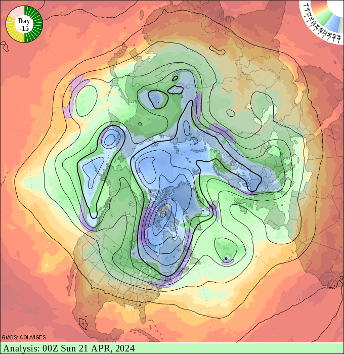
The animation shows a sequence of 31 frames
representing the state of the 500mb flow at 00Z on successive days. The
first 15 frames are past analyses, and are denoted by the green title bar
and green portion of the clock in the upper left corner. The analyses are
based on observations (weather balloons, aircraft measurements, satellite
measurements) assimilated into the computer model of the atmospheric
circulation. The animation pauses at day 0, representing the most recent
observed state of the atmosphere, and the start of the current forecast
cycle. The next 7 frames (yellow color keyed) are the first week of the AVN
high-resolution forecast. The final 8 frames (red keyed) are the
continuation of the AVN forecast at a lower resolution.
The red and blue shading indicate positive and negative
vorticity respectively. The black contours show the 500mb geopotential
height with a contour interval of 120 meters. The heavy contour is 5400m.
The form of these maps are essentially the same as the
500mb forecast and analysis
maps - see the key for the
forecast maps for more details.
Things to notice:
- The features tend to "spin"
counterclockwise around
the North Pole, reflecting the pervasive west-to-east circulation in the
troposphere. The rate of motion is considerably slower at low latitudes,
with features in the tropics appearing rather stationary, or even moving
clockwise.
- The picture becomes very "smooth" in the interval
from Day 7 to Day 8. This reflects the reduction in resolution of the
model at that point. You may also notice that the character of the
circulation appears to change at this point (e.g. features wash out, and
the rate at which the vorticity features traverse the map abruptly
changes). This indicates the effect that horizontal resolution may have on
model simulation. Presumably, the higher the resolution, the better the
forecast.
- Sometimes there appears to be an abrupt change in
the character of the circulation at the transition from analyses to
forecast. This may indicate that the model is not representing the
circulation well, and may indicate a poor forecast. However, this effect
is not well understood, and is a topic of ongoing study. One motivation
for conducting ensemble forecasts (with many realizations of the same
forecast period) is to isolate and disregard such inconsistent forecasts
by comparing each member of the ensemble to the whole.


 |